This section discusses visual support in general and then looks in more detail at figures, graphs, tables and equations. Most theses contain some kind of visual support to clarify information found in the body of the thesis, in particular in the results section. Visuals play an important role as readers tend to scan them in a report to gain an initial understanding of its quality and relevance. Often the most important findings are presented in the form of visuals such as figures, tables, graphs, and equations . Any visual support should include the following: introduction to the visual, the visual itself, an informative caption and a commentary (see below). Click on ”Figure 2 extreme rainfall events” below to open in a separate tab.
It is important to comment on the visual information, highlighting to your reader what they should notice and why this is important. A data commentary typically contains the following:
Location statement
e.g. Figure 1 shows / illustrates / summarises
Linking as-statement
e.g. As can be seen
Highlighting statement
drawing attention to key informationSometimes there will be : Discussions of implications
Figure 2 shows the number of extreme rainfall events with at least 90mm of precipitation over 1000 km2 for a 24-hours period in Sweden during last decades. As can be seen, the tendency is slightly increasing since the 70’s with the highest number of events reached in the last decade.(Student master thesis: Sande Beiro and Serrano Manso 2012)
Tips:
All visuals are categorised as figures or tables.
A figure caption appear under the figure whereas a table caption appears above the table.
Choose your figure with care: do you want to show more complete results? Use a table. Do you want to show trends? Use a graph.
Check that you have permission to use a figure if it is taken from another source and make sure you reference it if you do.
The type of information being presented often lends itself to a certain type of visual support. The common types are listed below with examples and tips. The visual support should be placed as close as possible to the commentary in the text.
Figures
Figures include most illustrations ranging from photographs and diagrams to line drawings. Each figure should be individually labelled, either Figure 1, Figure 2 etc or according to the section it is in i.e. Figure 2.1 (the first figure in section 2). The caption should appear below the figure ( see the example above). There are 2 options for labelling figures, ”Figure 1” for the first image, ”figure 2” for the second, etc or number the figure according to its place in the report i.e. Figure 2.1 is the first figure in section 2.
Tips:
The more complicated the information, the simpler the illustration should be
A figure should be clear and easy to read with consistent fonts and font sizes
Think about what the image will look like if printed in black and white
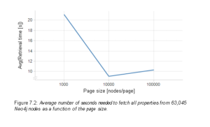
Graphs
Graphs are useful to illustrate trends or movement of data. The most common types are line graphs and bar charts. With all graphs, take care to label both axes and specify the units used.
(source: Student master thesis: Näsholm 2012)
Tips:
With more than one line, use different styles or colours
Think about what the image will look like printed in black and white
Labels for bars should be horizontal if possible
Arrange the bars in the order your reader will find most useful
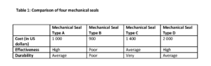
Tables
A table is useful when a writer wants to compare several items, and uses the same criteria or categories of comparison for each. It is also useful if the aim is to show detailed information and/ or when comparing both figures and text.
Tips:
The caption should go above the table
Make sure that each column and row is labelled
The unit of measure should be indicated in either the Column heading or the Row heading
Equations
Equations are not visuals! Equations should be presented within running text or displayed on lines by themselves, though the latter is most common. When the equation appears on a line by itself, it is still part of a sentence and should be punctuated accordingly. This can be seen in the example below. Also note that the equation is numbered using round brackets and should be aligned right of the equation (in this example, the line spacing is larger than should be).
Example
An ideal gas law analogy is
πA = nRT (1)
Tips:
The equation is usually centred on the page.
The equation number is usually right aligned and within round brackets.
Equations should be numbered sequentially in the text.
Refer to an equation as ”equation 1” or ”eq.1” but be consistent. This can be affected by the referencing system you are using. So check the standards.